
Ombre wedding dress
Ombre is a gradient rather than a single color, and this collection sits almost equally between bridal and prom: wedding mentions run just under half and prom just under half. Lace leads the details at around a third and gowns account for just over half.Purple appears specifically in around one in eight listings and gradient or ombre construction is named in around a third.Trains and slits each appear in around one dress in ten, and around one in seven has plus sizing. For a single solid shade instead, see gold dresses for weddings.








Ombre Wedding Dresses: Frequently Asked Questions
How is an ombre effect made?
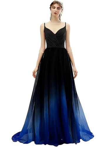
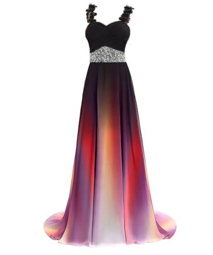
Either dip-dyed or printed fabric with the gradient built in during manufacturing, which suits slimmer silhouettes, or layered tulle in graduating shades, which is more common in full-skirted gowns since dyeing a large piece of tulle evenly is harder.
Where does the gradient usually run?
Most fade from a pale shade, often white or ivory, at the bodice to a deeper color at the hem, keeping the top half reading bridal in close photographs while introducing color through the skirt. A reversed gradient is less common and more dramatic.
Does the gradient placement change with size?
It can, on dip-dyed dresses, if the transition is placed by height from the hem rather than scaled to the garment, which can put it at a different point on a smaller or larger size. Layered tulle is less prone to this.
Does an ombre dress photograph differently?
Yes. Bright daylight shows the transition clearly; warm indoor lighting can compress the contrast between the two ends. Distance shots read as a soft wash, while close-up skirt shots make the transition band itself a visible feature.
Can an ombre dress be hemmed?
With more risk than a solid dress. On a dip-dyed dress, hemming removes fabric from the bottom, exactly where the deepest color sits, and can cut off that shade entirely. Order as close to the correct length as possible.
Can the bodice be altered without affecting the gradient?
On a layered tulle dress, yes, since the gradient lives in the skirt layers. Any alteration to the skirt itself, though, disturbs the layer relationship that creates the effect.
How do I tell bridal ombre from prom ombre?
Check the bodice color. Bridal-leaning styles use white, ivory or champagne at the top with softer overall contrast. Prom-leaning styles use brighter, more saturated combinations with corset backs or cut-out panels.
Why does purple show up so often?
Around one in eight listings features it specifically, usually as a pale lavender or ivory bodice deepening into a rich purple hem, one of the most common bridal ombre combinations.
Is plus sizing available?
Around one listing in seven mentions it. Given the alteration complications, order as close to your measurements as possible rather than planning significant changes afterward.
Two Ways an Ombre Effect Is Made
Knowing which construction a listing uses tells you a great deal about how the dress will hold up and photograph.
Dip-dyed or printed fabric is a single piece of chiffon, satin or crepe with the gradient applied during manufacturing. The transition is smooth and continuous, and the dress behaves like any other dress of that fabric in terms of weight and movement.
Layered tulle in graduating shades builds the gradient from separate layers of tulle in different colors, each slightly darker or lighter than the one above it. From a distance this reads as a smooth gradient; up close it is visibly layered.
The layered method is the more common one for full-skirted gowns, since dyeing a single large piece of tulle evenly is harder than dip-dyeing a smaller area of solid fabric. The dip-dyed method suits slimmer silhouettes and lighter fabrics better.
Neither is better; they simply produce different effects and suit different dress shapes.
Where the Gradient Runs
Most ombre wedding dresses fade from a pale shade, often white or ivory, at the bodice down to a deeper color at the hem. This keeps the top half reading as bridal white in close photographs while introducing color through the skirt.
A reversed gradient, deep at the top fading to pale at the hem, is less common and reads more dramatically.
Purple appears in around one in eight listings here specifically, which reflects a common combination: a pale lavender or ivory bodice deepening to a rich purple hem.
The practical point either way: the color at the hem is what shows in a standing full-length photograph, while the color at the bodice is what shows in close portraits. Consider both, not just the swatch shown at the top of the listing.
Consistency Across a Size Range
This is the detail ombre construction adds that a solid color never has to solve, and it is worth checking before ordering.
On a dip-dyed dress, the gradient has to be placed correctly relative to the body regardless of size, meaning the transition point should sit at roughly the same place on the garment across different sizes. A gradient placed by height from the hem rather than scaled to the garment can sit at a different, less flattering point on a smaller or larger size.
On a layered tulle dress, each size needs proportionally similar layer widths for the gradient to read the same way. This is less commonly a problem, since the layers are usually consistent regardless of size, but it is worth checking reviews from a similar size to yours specifically.
Photographing an Ombre Dress
A gradient behaves differently under different light than a solid color does, and it is worth expecting some variation across the day.
In bright, even daylight the transition reads clearly and smoothly.
Under warm indoor reception lighting, the paler end of the gradient can shift and the contrast between the two ends can appear to compress.
In photographs taken from a distance, the gradient reads as a soft color wash; in close-up shots of the skirt, the transition band itself becomes visible as a feature.
None of this is a flaw. It means an ombre dress gives a photographer more to work with across different shots than a flat color does, and it is worth mentioning the gradient to them in advance so they can choose angles that show it well.
Alterations Are More Complicated
This is the practical cost of the gradient, and it applies to both construction methods.
On a dip-dyed dress, hemming removes fabric from the bottom, which is exactly where the deepest color sits. Shortening the dress changes the gradient's proportions, potentially cutting off the deepest shade entirely.
On a layered tulle dress, taking in the waist or bodice does not affect the gradient in the skirt, but any alteration to the skirt itself disturbs the layer relationship that creates the effect.
The practical response: order as close to the correct length and fit as possible, and treat major alterations as a reason to reconsider the specific dress rather than a routine fix.
Prom and Bridal Overlap
With wedding and prom mentions running almost equally here, filtering matters more than in most collections.
Bridal-leaning ombre tends toward pale-to-color gradients in white or ivory at the top, softer overall contrast, and a more structured bodice.
Prom-leaning ombre tends toward brighter, more saturated color combinations, more dramatic contrast, and details like corset backs or cut-out panels that rarely appear in bridal.
Checking whether the bodice color is white, ivory or champagne is the fastest filter for a bridal search.
Sizing
Around one listing in seven mentions plus sizing.
Take bust, underbust, waist and hip as standard, and for mermaid cuts add thigh.
Given the alteration complications above, order as close to your measurements as possible rather than planning significant changes after the dress arrives. The US size chart covers conversions.
Related Collections
For a single solid metallic shade, see gold dresses for weddings. For tulle construction specifically, browse tulle wedding dresses. For other non-traditional bridal, see non traditional wedding dresses.